Medically Reviewed
Dr. Jose Rossello, MD, PhD, MHCM
Preventive Medicine & Public Health Specialist
Last Reviewed: May 4, 2026
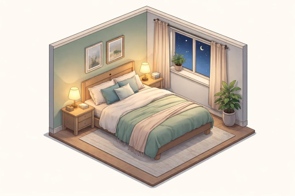
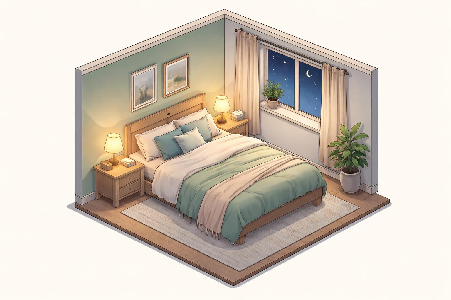
The color you paint your bedroom walls can influence how well you sleep each night. Blue, green, and white are the best bedroom colors for sleep because they promote calmness and relaxation, helping your body prepare for rest. These cool-toned colors create a soothing environment that can make it easier to fall asleep and stay asleep throughout the night.
Bedroom color affects sleep[1] by changing how people feel and think before bed. Warm colors like red and orange can make the mind more alert and active. Cool colors work differently by helping the body and mind slow down.
Choosing the right shade matters just as much as picking the right color. The brightness and tone of a color can change how it makes someone feel. Understanding which colors help with sleep and which ones make it harder can lead to better rest and more energy during the day.
Table of Contents
Key Takeaways
- Cool colors like blue and green help promote relaxation and longer sleep
- Warm colors such as red and orange can stimulate the brain and disrupt rest
- The brightness of a color affects its impact on mood and sleep quality
Understanding the Impact of Color on Sleep Quality
The colors surrounding a person during sleep affect their emotional state and physical responses in measurable ways. Research shows that bedroom color may affect sleep through emotional changes[1], as certain hues trigger specific psychological and physiological reactions that either promote relaxation or increase stimulation.
The Role of Color Psychology in the Bedroom
Color psychology examines how different hues influence human behavior and mental states. When selecting bedroom colors for sleep, people benefit from understanding that their brain processes colors as environmental signals.
Cool colors with short wavelengths create different effects than warm colors with long wavelengths. The sleep environment responds to these visual cues in predictable patterns. People tend to prefer cool-toned colors for interior spaces because these shades naturally promote calmness.
Cultural learning and instinctual responses both shape how individuals react to specific colors. A person’s color preferences can change over time based on life experiences. However, certain emotional associations with colors remain consistent across different populations and geographic regions.
How Emotional Responses Influence Sleep
Poor mood directly interferes with sleep quality. When someone feels tense or focused before bed, their body struggles to transition into a restful state.
The color of a bedroom can impact sleep[2] by triggering emotional reactions that either support or hinder relaxation. Colors convey information about surroundings and guide appropriate responses. A red stop sign creates alertness, while blue water suggests tranquility.
Negative emotions like anxiety, anger, or sadness make falling asleep more difficult. Sleep experts recommend developing routines that promote relaxation before bed. Choosing colors that evoke positive emotional states helps create this calming atmosphere.
The Science Behind Calming Hues
Studies reveal that certain colors can reduce heart rate and blood pressure[1]. Blue wavelengths trigger these physiological changes by activating the body’s relaxation response.
Shorter wavelength colors produce cooling effects that help prepare the body for rest. Research demonstrates that people with blue bedrooms reported longer average sleep duration compared to those with other colored rooms. Green similarly promotes relaxation through its association with nature and outdoor environments.
White may help with sleep because it stimulates the brain less than vibrant colors. Some researchers suggest that neutral tones allow people to clear their minds more easily before sleep. The brightness of any color also matters, as darker shades can sometimes evoke negative emotions even when the base color typically feels calming.
Best Colors for Sleep and Relaxation
Certain colors create a more restful bedroom environment by promoting calmness and reducing stress before sleep. Blue, green, yellow, and neutral tones[1] have been shown to support relaxation through their psychological effects on mood and emotional state.
Benefits of a Blue Bedroom
Blue stands out as one of the best bedroom colors for sleep[3] based on research and surveys. People with blue bedrooms report getting the longest average sleep per night compared to those with other colored rooms.
The color blue promotes relaxation through its association with calm skies and peaceful water. Studies show that blue is strongly linked to words like “relaxed,” “safe,” “satisfied,” and “secure.” Some research suggests that viewing blue can reduce heart rate and blood pressure[1], creating ideal conditions for sleep.
Blue falls on the short wavelength end of the visible light spectrum. People naturally prefer these cool-toned colors for interior spaces. However, darker shades of blue can sometimes trigger negative feelings like sadness or loneliness, so lighter blue tones work better for most bedrooms.
Soothing Effects of Green Tones
Green serves as another excellent choice among bedroom colors for sleep[4] due to its calming properties. Like blue, green has a short wavelength that places it in the cool color category.
The soothing effects of green come from its strong connection to nature and plant life. People report that green evokes feelings of comfort, peace, spaciousness, hope, and happiness. Common positive words associated with green include “outdoors,” “grateful,” and “merry.”
The brightness of green matters significantly. Light green shades remind people of the outdoors and fresh growth. Darker shades of green may create negative associations with decay, making lighter tones the better option for sleep spaces.
Yellow Bedrooms for Morning Positivity
Yellow bedrooms[3] can support better sleep when used in the right shade. Light, soft yellow tones promote relaxation and create a warm, inviting atmosphere without being overstimulating.
The key to using yellow successfully lies in choosing pastel or muted shades rather than bright, vibrant ones. Light yellow can help people wake up feeling more positive and energized in the morning. This makes it useful for those who struggle with morning mood.
However, yellow is a warm color with a longer wavelength than blue or green. Very bright or dark yellow shades may prove too stimulating for sleep. Pale, buttery yellows work best as they maintain the color’s positive associations while keeping the space calm.
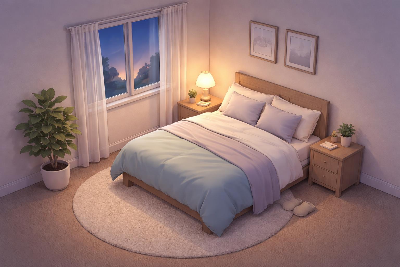
The Calming Influence of Whites and Neutrals
White and neutral colors create peaceful bedroom environments that support quality sleep. White combines all colors across the visible light spectrum and associates with positive words like “peace,” “secure,” “safe,” and “relaxed.”
White rooms may help with sleep[1] because they stimulate the brain less than colorful rooms. The association with emptiness and lack of emotion can actually benefit sleep by helping people clear their minds before bed.
Neutral colors like beige, light gray, and silver offer similar benefits. These shades provide a blank canvas that reduces visual stimulation. Light neutrals also make rooms feel larger and more open, which can reduce feelings of stress or confinement that might interfere with relaxation.
Colors to Avoid: Stimulating Shades That Disrupt Rest
Certain colors activate the mind and body in ways that work against relaxation and quality sleep. Warm, intense colors and extremely dark shades can trigger physical responses like increased heart rate or negative emotions that make falling asleep more difficult.
Why Red and Vibrant Hues Are Problematic
Red stands out as one of the worst bedroom colors for sleep[1] due to its stimulating effects on the body and mind. This color has the longest wavelength on the visible light spectrum, which triggers stronger physical reactions than cooler tones.
Research shows that viewing red may increase blood pressure and pulse rate[1], making it harder for the body to enter a relaxed state before sleep. People associate red with stressful concepts like panic, injury, and pain rather than calmness.
Orange and yellow create similar problems as warm colors with stimulating properties. These vibrant hues activate the mind rather than quiet it down for rest. Rooms painted in these colors can feel more energizing, which works well for spaces like kitchens or home offices but contradicts what a bedroom needs.
The Impact of Black and Dark Tones
A black bedroom[1] might seem logical since darkness promotes sleep, but the color itself carries strong negative emotional associations. Black absorbs all wavelengths of visible light and connects strongly to feelings of depression, sadness, anger, and fear in most people’s minds.
Waking up surrounded by black walls can set a negative tone for the morning. Dark brown and other deep, muted colors also fall into the category of worst colors for sleep[3] because they evoke anxiety and sadness.
While complete darkness helps regulate sleep-wake cycles, painting walls in very dark colors differs from using blackout curtains or sleeping in a dark room at night.
Complications with Overly Bright or Glossy Colors
Extremely bright colors create too much visual stimulation, even in calming color families. A neon blue or electric green provides more activation than relaxation, despite blue and green typically being good choices in muted tones.
High-saturation colors cause problems because they:
- Stimulate the brain more actively than soft, muted versions
- Create visual intensity that keeps the mind alert
- Reflect more light around the room
Glossy or shiny paint finishes amplify these issues by bouncing light throughout the space. Even a typically calming color becomes disruptive when applied in a high-gloss finish that creates glare and visual activity. Matte or eggshell finishes work better for bedroom walls regardless of the color chosen.
Creating the Ideal Sleep Environment
Choosing the right bedroom color works best when combined with proper lighting, window treatments, and personal design choices. These elements work together to create a space that supports quality rest.
Integrating Color with Lighting and Textiles
The sleep environment depends on how bedroom colors interact with light sources and fabrics. Cool colors like blue and green appear different under warm versus cool lighting. Warm bulbs can make blue walls look slightly green, while cool LED lights preserve the true color.
Natural light changes wall colors throughout the day. A color that looks calming at night might appear harsh in bright morning sun. Testing paint samples at different times helps identify how the shade changes.
Textiles add depth to bedroom colors:
Elevate Your Health for Just $29.99/Month
Join the Precision Wellness Subscription at My Healing 365 and get discounted services, priority coaching access, virtual care, and exclusive wellness resources to support your physical, emotional, and hormonal health.
Join for $29.99/Month- Bedding in complementary shades reinforces the calming effect
- Curtains that match or contrast with walls create visual balance
- Rugs and throw pillows introduce texture without overwhelming the space
The brightness of textiles matters as much as wall color. Dark sheets against light walls create contrast that some find stimulating. Matching the intensity of fabrics to wall colors creates a more unified look that supports relaxation.
Using Blackout Curtains to Enhance Restfulness
Darkness plays a critical role in sleep quality regardless of wall color. Blackout curtains[1] help create the dark environment needed for proper rest by blocking external light sources.
These curtains work with bedroom colors rather than against them. Light-colored rooms benefit most from blackout curtains since pale walls reflect more light. Dark curtains on light walls provide functional darkness while maintaining the calming color scheme during daytime hours.
Benefits of blackout curtains include:
- Blocking streetlights and early morning sun
- Reducing outside noise slightly
- Helping regulate room temperature
- Supporting consistent sleep schedules
The curtain color should complement the wall shade. Navy or charcoal curtains pair well with blue or white walls. Green walls work with forest green or cream-colored blackout options.
Incorporating Personal Preferences and Style
Individual responses to color vary based on personal experiences and cultural background. Someone who finds gray calming might feel depressed by the same shade based on their associations with that color.
The bedroom should reflect personal taste while supporting sleep. A person who loves warm colors can choose softer versions of orange or yellow rather than avoiding them completely. Muted coral or pale gold provides warmth without the stimulating effects of bright warm tones.
Ways to balance preference with sleep needs:
- Use favorite colors in small doses through accessories
- Choose lighter or darker versions of preferred shades
- Paint one accent wall in a bolder color while keeping other walls neutral
- Select artwork that incorporates preferred colors
The goal is creating a space that feels comfortable and personal. A room painted in recommended colors that feels sterile won’t support relaxation as well as a personalized space using sleep-friendly shades.
Tips for Choosing and Applying Bedroom Colors
The right paint selection involves more than picking calming shades. Room dimensions, light exposure, and surface treatments all affect how bedroom colors for sleep actually appear and function in the space.
Matching Colors with Bedroom Size and Natural Light
Small bedrooms benefit from lighter shades of the best bedroom colors like pale blue, soft green, or warm white. These tones make compact spaces feel more open and airy. Darker colors can make small rooms feel cramped and closed in.
Large bedrooms offer more flexibility with color choices. Deeper shades of blue or green work well in spacious rooms without making them feel smaller. These rooms can handle bolder applications of colors that help you sleep[1].
Natural light significantly changes how paint appears throughout the day. North-facing rooms receive cooler, indirect light that can make blues and greens feel cold. These rooms work better with warmer neutrals or softer greens.
South-facing bedrooms get warm, direct sunlight that intensifies paint colors. Cool tones like blue balance out the warmth. East and west-facing rooms shift in temperature throughout the day, so test paint samples at different times before committing.
Selecting Finishes: Matte vs. Glossy
Matte and flat finishes absorb light rather than reflecting it. This creates a calm, non-stimulating environment ideal for sleep. Matte paints hide wall imperfections better than glossy options and create a softer appearance.
Eggshell and satin finishes offer slight sheen while maintaining a relaxed feel. They’re easier to clean than flat paint, which matters for bedrooms. These mid-range finishes work well for most sleep-promoting colors.
Glossy and semi-gloss finishes reflect light and create visual stimulation. This makes them poor choices for bedroom walls where relaxation matters. The reflective quality can interfere with the calming effects that make certain bedroom colors effective for better sleep[4].
Ceilings should stay matte or flat regardless of wall finish choice. This prevents light reflection that could disrupt sleep preparation.
Coordinating Wall Colors with Decor
Wall colors should complement existing furniture and bedding rather than clash with them. White or cream bedding pairs well with any of the recommended colors for sleep. Dark furniture stands out against lighter blue or green walls.
Wood tones affect color perception in the room. Warm wood finishes look best with soft greens, warm grays, or beige walls. Cool-toned or painted furniture works with blue or cooler gray shades.
Accent colors in artwork, rugs, or throw pillows should enhance rather than compete with the main wall color. A soft blue bedroom can include small touches of warm neutrals for balance. Green walls pair naturally with earth tones and natural materials.
Limit the number of colors in the bedroom to maintain a restful atmosphere. Stick to two or three main colors throughout the space. Too many competing shades create visual chaos that works against the calming effects of carefully chosen bedroom colors for sleep.
Balancing Aesthetics and Sleep: Practical Decorating Advice
Creating a bedroom that promotes rest doesn’t mean sacrificing personal style. The best approach combines calming bedroom colors for sleep with individual preferences and lifestyle needs.
Customizing Colors for Couples or Families
Partners often have different color preferences, which can make selecting bedroom colors for sleep challenging. A neutral base provides common ground while allowing each person to add personal touches through accessories.
Compromise strategies include:
- Painting three walls in one partner’s preferred calming shade and using an accent wall for the other’s choice
- Selecting a mutually agreeable neutral like soft gray or warm beige for walls
- Using bedding and pillows to incorporate both partners’ favorite colors
For families with young children sharing rooms, lighter shades of blue or green work well across age groups. These colors remain age-appropriate as children grow and require fewer repaints. Parents can rotate accent colors through removable items like curtains, rugs, and wall art to refresh the space without major overhauls.
Blending Trends with Sleep Science
Interior design trends change frequently, but colors that help you sleep[1] remain consistent. Blue, green, and soft neutrals continue to support better rest regardless of what’s fashionable.
Homeowners can incorporate trendy colors through furniture, artwork, and textiles rather than wall paint. This approach allows for style updates without compromising the room’s calming foundation. A bedroom with pale blue walls gains visual interest through a terra cotta throw blanket or sage green chair.
Dark, dramatic colors popular in design magazines may look striking but often disrupt sleep quality. When darker shades appeal aesthetically, reserve them for one accent wall behind the bed where they’re less visible when preparing for sleep. The remaining walls should use lighter, more restful tones.
Adapting to Changing Needs Over Time
Sleep needs and color preferences shift throughout life stages. Young adults may prefer brighter, more energetic spaces, while older adults often benefit from softer, more muted tones that reduce visual stimulation.
Physical changes also affect color choices. As vision changes with age, higher contrast between walls and furnishings becomes more important for safety and comfort. A person who once loved an all-white bedroom might need warmer beige tones for better depth perception.
Life circumstances like stress levels, work schedules, and health conditions influence which colors for sleep work best. Someone experiencing high stress might need cooler, more calming blues, while someone seeking energy in the morning might choose a soft yellow-green. Reassessing bedroom colors every few years ensures the space continues supporting current sleep needs rather than past preferences.
Frequently Asked Questions
Certain paint colors create calming environments that support better rest, while warm tones like red and bright orange can overstimulate the mind and disrupt sleep patterns.
What bedroom paint colors are most relaxing for adults?
Blue stands out as one of the most relaxing bedroom colors for adults. People associate blue with calmness and relaxation[1], making it an ideal choice for sleep spaces.
Green also promotes relaxation due to its connection with nature and the outdoors. This cool-toned color evokes feelings of comfort, peace, and happiness.
Soft whites and warm beiges create peaceful environments without overwhelming the senses. These neutral tones help clear the mind before sleep while maintaining a serene atmosphere.
Which wall colors promote deeper sleep at night?
Cool-toned colors with shorter wavelengths help promote deeper sleep. Blue bedrooms show promising results, with one survey finding that people with blue bedrooms had the longest average sleep duration compared to other colors.
Green walls may support restful sleep through their calming properties. The color’s association with plants and nature helps create a comfortable, peaceful environment.
Soft gray and warm white also contribute to better sleep quality. These colors stimulate the brain less than vibrant hues, allowing the mind to settle more easily at bedtime.
What light color is best for sleep when using LED bulbs or strips?
Warm white or amber-toned LED lights work best for bedroom lighting. These colors have longer wavelengths that don’t interfere with the body’s natural sleep-wake cycle as much as blue-toned light.
Red or orange LED lights can be suitable for nighttime use. However, bright red should be avoided on walls, as the color can increase blood pressure and pulse rate.
Blue LED light should be minimized in the hours before sleep. This wavelength can suppress melatonin production and make falling asleep more difficult.
What bedroom colors are recommended in Feng Shui to support restful sleep?
Feng Shui principles recommend earthy tones like beige, cream, and tan for bedrooms. These colors create grounding energy that promotes rest and relaxation.
Soft blues and greens align with Feng Shui practices for sleep spaces. These colors represent natural elements that bring calming energy into the room.
Pale pink also fits within Feng Shui guidelines for bedrooms. This gentle color promotes a peaceful atmosphere without being too stimulating.
Are there any bedroom colors that can disrupt sleep and should be avoided?
Red may be the worst color for bedrooms[1] because it stimulates the nervous system. People often associate red with fear, anger, and excitement, which prevents relaxation before sleep.
Bright orange and yellow can also interfere with rest. These warm colors with long wavelengths are highly stimulating and may keep the mind active when it should be winding down.
Dark colors like black and brown might disrupt sleep through negative emotional associations. Black is strongly linked to depression, sadness, and fear, which don’t create a restful mood.
What are the top three bedroom colors most associated with better sleep?
Blue, green, and white are the best bedroom colors for sleep[4]. Blue promotes the most relaxation due to its association with calm skies and water.
Green follows as a strong second choice. Its connection to nature and the outdoors helps people feel comfortable and peaceful as they prepare for bed.
White rounds out the top three because it stimulates the brain less than other colors. The simplicity of white helps people clear their minds and associate the space with emptiness and peace.
Post Views: 3


